We provide you with default styles in Hosted Fields, but you can remove the default styles and add your own custom styles to match the look and feel of the merchant's website.
Our styling options include the following:
- Default styles
- Custom styles
- fieldValidityChange event
Default styles
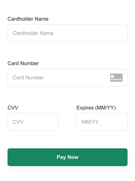
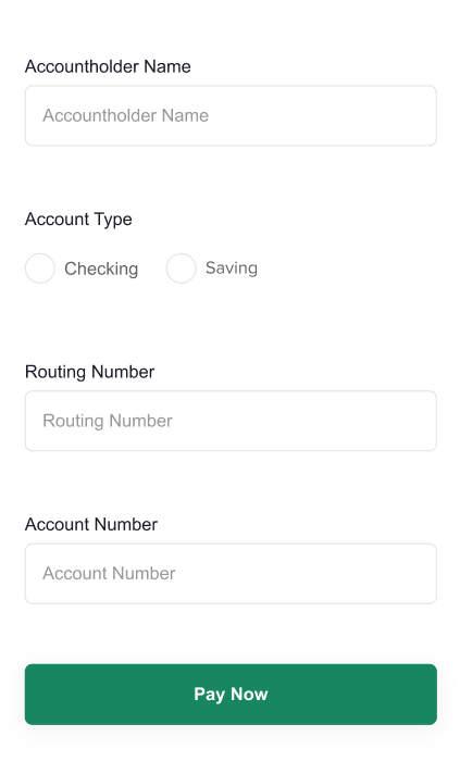
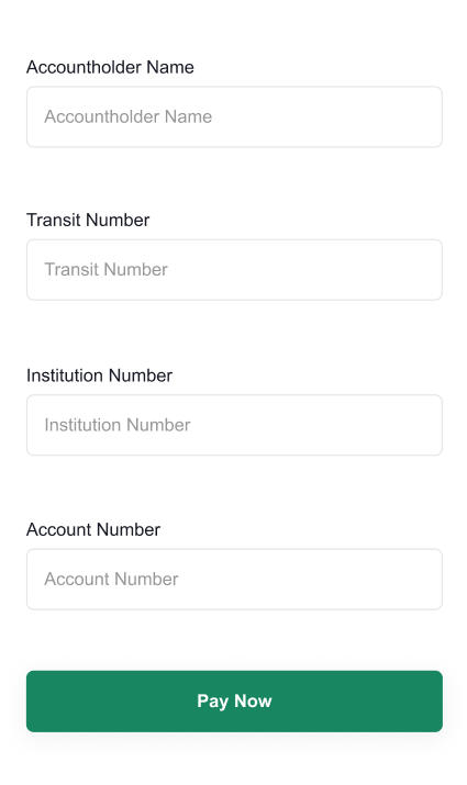
Our default styles render your form to look like the following:
Card form
ACH form
PAD form
Custom styles
To change the look and feel of the form, update your CSS, for example, the following code changes the color of the submit button on the form to red:
styles: {
    disableDefaultStyles: true,
    css: {
      "button[type='submit']": {
        'background-color': '#d72d2d',
        'border-color': '#d72d2d',
      },
    },
}
Remove the default styles
To remove the default styles, add a styles object to the config of the Hosted Fields JavaScript library with the following:
- A disableDefaultStyles parameter with a value of
true. - Your custom styles.
styles: {
    disableDefaultStyles: true,
    css: {
      // Custom styles
      },
    },
Default CSS
If you add custom styles to your CSS, we recommend that you copy our default CSS and make your changes to it.
css: {
    body: {
      margin: "0",
    },
    form: {
      display: "flex",
      "align-items": "center",
    },
    input: {
      "line-height": "2",
      "box-sizing": "border-box",
      border: "1px rgb(158, 158, 158) solid",
      width: "100%",
      height: "100%",
      padding: "8px",
      "border-radius": "5px",
      "background-color": "#FFF",
      color: "rgb(99, 99, 99)",
      "text-align": "left",
      "font-size": "0.8rem",
    },
    label: {
      padding: "8px 0",
      "font-family": "Arial",
      "font-size": "0.8rem",
      display: "inline-block",
    },
    ":focus": {
      outline: "none",
    },
    "::placeholder": {
      color: "rgb(158, 158, 158)",
    },
    "input[type='text']": {
      "min-height": "45px",
    },
    "::before": {
      content: "",
      width: "1rem",
      height: "1rem",
      "flex-basis": "1",
      "border-radius": "50%",
      transform: "scale(0)",
      "transform-origin": "center center",
      transition: "60ms transform ease-in-out",
      "box-shadow": "inset 1rem 1rem rgb(23, 134, 97)",
    },
    ":checked::before": {
      transform: "scale(1)",
      "transform-origin": "center center",
      width: "23px",
      color: "red",
      outline: "1px black solid",
      "line-height": "2",
    },
    button: {
      "background-color": "rgb(23, 134, 97)",
      color: "#FFF",
      border: "1px rgb(23, 134, 97) solid",
      "border-radius": "8px",
      width: "100%",
      "text-align": "center",
      "min-height": "45px",
      padding: "8px",
    },
    div: {
      margin: "0",
      display: "flex",
      "align-items": "center",
      "justify-content": "center",
      "margin-left": "8px",
    },
    'input[type="radio"]': {
      "line-height": "unset",
      "box-sizing": "content-box",
      appearance: "none",
      "background-color": "#fff",
      margin: "0",
      "border-radius": "50%",
      width: "1.5rem",
      height: "1.5rem",
      "border-color": "rgb(158, 158, 158)",
      color: "rgb(23, 134, 97)",
      display: "flex",
      "justify-content": "center",
      "align-items": "center",
      "flex-direction": "column",
      padding: "unset",
      "min-height": "unset",
      "margin-right": "5px",
    },
    'input[type="radio"]::before': {
      content: "'.'",
      width: "1rem",
      height: "1rem",
      "flex-basis": "1",
      "border-radius": "50%",
      transform: "scale(0)",
      "transform-origin": "center center",
      transition: "60ms transform ease-in-out",
      "box-shadow": "inset 1rem 1rem rgb(23, 134, 97)",
    },
    'input[type="radio"]:checked::before': {
      transform: "scale(1)",
      "transform-origin": "center center",
    },
    "input.invalid": {
      color: "#d72d2d",
      "border-color": "#d72d2d",
    },
    ".loading-svg": {
      display: "none",
      color: "rgb(255, 255, 255)",
    },
    ".button-text": {
      display: "inline-block",
    },
    ".loading .loading-svg": {
      display: "inline-block",
    },
    ".loading .button-text": {
      display: "none",
    },
    ".spin": {
      animation: "spin 1s linear infinite",
    },
    "@keyframes spin": {
      to: {
        transform: "rotate(1turn)",
      },
    },
    "button:hover": {
      cursor: "pointer",
    },
  },
Supported CSS elements
- animation
- align-items
- appearance
- background-color
- border-color
- border-radius
- border
- box-shadow
- box-sizing
- color
- content
- direction
- display
- flex-basis
- flex-direction
- float
- font-family
- font-size
- font-style
- font-weight
- font
- height
- justify-content
- letter-spacing
- line-height
- margin-bottom
- margin-left
- margin-right
- margin-top
- margin
- max-width
- min-height
- opacity
- outline
- padding-bottom
- padding-left
- padding-right
- padding-top
- padding
- text-align
- text-shadow
- transform-origin
- transform
- transition
- width
Supported HTML elements
- button[type="submit"]::after
- button[type="submit"]::before
- button[type="submit"]:active
- button[type="submit"]:after
- button[type="submit"]:before
- button[type="submit"]:checked
- button[type="submit"]:disabled
- button[type="submit"]:enabled
- button[type="submit"]:focus
- button[type="submit"]:hover
- button[type="submit"]:indeterminate
- button[type="submit"]:not(:checked)
- input[type="radio"]:active
- input[type="radio"]:checked::before
- input[type="radio"]:checked
- input[type="radio"]:disabled
- input[type="radio"]:enabled
- input[type="radio"]:focus
- input[type="radio"]:hover
- input[type="radio"]:indeterminate
- input[type="radio"]:not(:checked)
- input[type="submit"]::after
- input[type="submit"]::before
- input[type="submit"]:active
- input[type="submit"]:after
- input[type="submit"]:before
- input[type="submit"]:checked
- input[type="submit"]:disabled
- input[type="submit"]:enabled
- input[type="submit"]:focus
- input[type="submit"]:hover
- input[type="submit"]:indeterminate
- input[type="submit"]:not(:checked)
- input[type="text"]:active
- input[type="text"]:checked
- input[type="text"]:disabled
- input[type="text"]:enabled
- input[type="text"]:focus
- input[type="text"]:hover
- input[type="text"]:indeterminate
- input[type="text"]:not(:checked)
- .button-text
- .invalid
- .loading .button-text
- .loading .loading-svg
- .loading-svg
- .spin
- .valid
- body
- button::after
- button::before
- button:active
- button:after
- button:before
- button:checked
- button:disabled
- button:enabled
- button:focus
- button:hover
- button:indeterminate
- button:not(:checked)
- button
- button[type='submit']
- div:first-of-type
- div
- fieldset
- form
- input.invalid
- input.valid
- input
- input[type='radio']::after
- input[type='radio']::before
- input[type='radio']:after
- input[type='radio']:before
- input[type='radio']
- input[type='submit']
- input[type='text']::after
- input[type='text']::before
- input[type='text']:after
- input[type='text']:before
- input[type='text']
- label
fieldValidityChange event
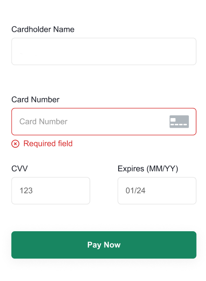
If a customer enters an incorrect value, our default styles apply a red border and text with more information about the error, for example:
To change the style when the customer enters a correct value or an incorrect value in the Hosted Fields, subscribe to the fieldValidityChange event and update your CSS with:
- A disableDefaultStyles parameter with a value of
true. - Your custom styles.
For example, to change the default red border to a blue border for incorrect information, include the following code in your CSS:
styles: {
    disableDefaultStyles: true,
    css: {
      "input.invalid": {
            "border-color": "#335bff"
        }
      },
    }
Subscribe to the event
To subscribe to the fieldValidityChange event, add an event listener to your form, for example:
cardForm.on("fieldValidityChange", ({ field, ValidationError }) => {

});
Handle the response
If the customer enters a value and triggers the event, you receive a response that contains the name of the field that triggered the event and the validation error.
If the customer enters a letter in the card number field, the event returns the following:
{
    "field": "cardNumber",
    "validationError": "Card number must contain numbers only"
}
Note: If you change the styles to highlight a valid entry, we return a value of undefined for the validationError field.